


My name is Hannah O'Meara, I’m Senior Manager, Revenue Operations at Tripadvisor. I believe business decisions should be made first on verified data, and then supplemented by external observations.
In this article, I’ll talk about the steps I've taken to move company decision making from hypothesizing with “I think/I feel this is what's happening” to solid understanding with “I know this is happening based on measurable data”.
I'll also be sharing best practices for gaining trust in your reporting and sharing your insights.
Here’s our main talking points:
- A bit of context
- A non-traditional journey to RevOps by way of revenue management
- Key takeaways
- Common questions
Let’s dive in 👇
A bit of context…
My background in RevOps
My journey in RevOps started in 2011, when I was working for a small meeting and events facility in Philadelphia.
I was doing RevOps before RevOps was even a thing. My title was Sales Support but because we were a smaller organization, I wore many hats - from marketing strategy and lead generation, configuring and customizing our Salesforce instance, to reporting out on performance and forecasting growth.
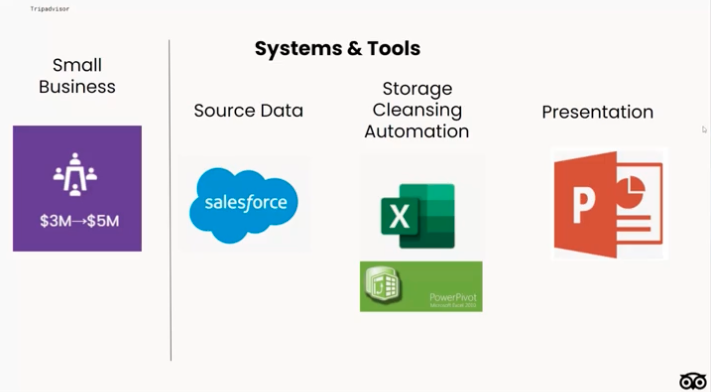
Being a small operation of about 2 million when I joined, we didn't have a lot of resources, so the majority of my day was spent in Salesforce and Excel.
I learned any and every formula I could to help streamline processes, but there's always something you can't automate, or something that you have to add in quickly at the last minute that breaks your whole process.
The dreaded report
In a perfect world, all systems would be easily integrated. You could produce a single report that shows you everything you want to look at, all in one view.
Even as a well established business that does have a pretty streamlined report, in fast-paced and high-growth environments it’s tough to automate - and even tougher to change if one of your business processes changes.
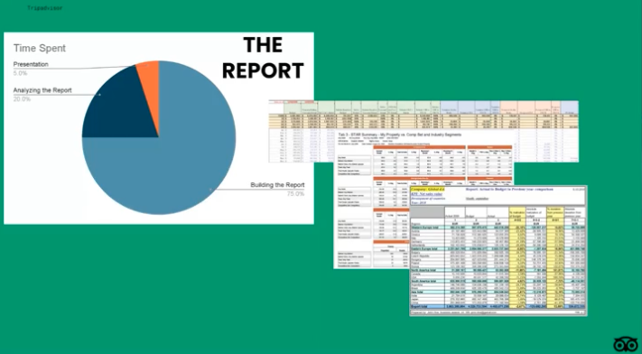
In my early days, I would spend an entire day exporting, cleaning and manipulating data to get it into our main report that was reviewed by leadership every single week.
Because I spent all day just getting the report together, I spent maybe only an hour actually analyzing it and a quick 10 minutes dropping it into a PowerPoint right before the meeting.
Usually, we would get stuck on a single data point that someone noted as being wrong, and the rest of the time was spent doing impromptu training about how to read the report that was too complicated.
Then, maybe only five minutes was actually spent reviewing the insights I had pulled out.
A non-traditional journey to RevOps by way of revenue management

In 2018, I was working as a sales rep for Convene, a New York based company that sells event space and office space.
Convene had decided to form a revenue management department. Revenue management is typically found in industries with fixed inventories, like hotel rooms and airline seats, and in my case, a fixed number of rooms and offices.
Revenue management has long been established in these industries as the bridge between sales, marketing and operations to maximize revenue across all channels and departments.
I pitched a RevOps role under the Revenue management header. I talked about outlining the need for a centralized operations team that would work to streamline all of our data and processes across our partner departments.
The use case here was pretty simple. All of these departments were pulling and producing their own data and reports, and depending on who generated them, they all told a different story.
I wanted to fix this and luckily it didn't take much convincing. I was brought on to build out the RevOps team at Convene.
Step 1: Document the process & build a use case
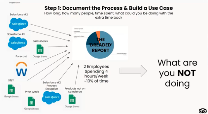
My very first initiative was to streamline reporting processes and take over the dreaded revenue report, which was still being run in Excel and required exports from several different systems.
All in all, we had about eight source inputs, and they had to run and be merged manually.
Building this report was complex and very time-consuming. On a good day, it would take about four hours to run, maybe more if we ran into an error.
Then, we would send out a massive Excel file each week to all of our stakeholders, and they would have that single static report for their weekly meetings, which was outdated within two days.
I realized we needed resources besides Excel, so I started building a business case for alternative reporting resources.
I recorded and documented the process for updating the report each week, and outlined each data source along with the time spent building and troubleshooting.
I also outlined the bigger picture initiatives the team would be able to push forward faster with the extra time back.
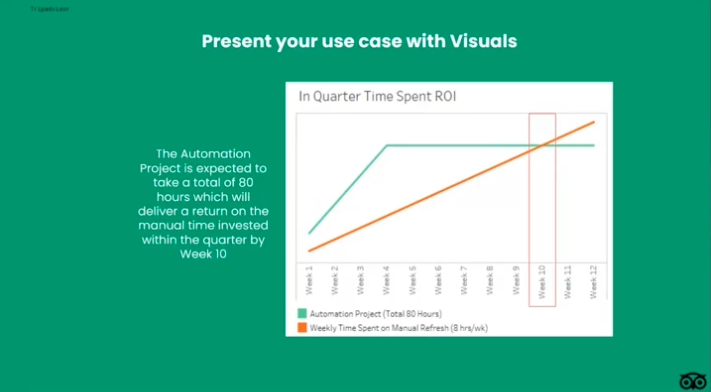
It's not enough to write up documentation about how much time this will save and how good it will be for the company. You have to be able to show the benefit with a visual.
The best analysts will not only be able to find anomalies and insights in your data, but also know how to present those anomalies and insights clearly, with a story behind them.
It's also not enough to build a beautiful infographic and hope that your audience understands all the nuances that you do.
You need to show the data in a way that will guide the user in the direction they're supposed to go, or in the direction you want them to go.
The same data set can be shown in a million ways and tell a different story each time, depending on how you show it. It's really important to be careful and thoughtful about all your presentations.
Step 2: Work with what you have
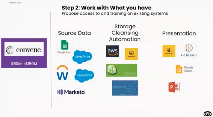
Whether you're including potential solutions in your use case or you've gotten the go ahead to start researching fixes, start by taking stock of all the systems you have.
I worked with the engineering and analytics team who were already in the process of building a data warehouse, to ensure they incorporated the sources I needed to build out our report.
In the hospitality world, we're all working with limited headcount and resources, so I encourage all analysts to learn as many systems as possible.
If you're working with a limited budget, take a class in Microsoft Power Query or learn the Google Sheets query function.
Most analysts at least have access to Excel and you can use queries to access most of your systems (like Salesforce, your data warehouse, etc.) for free.
If you're lucky enough to have a data warehouse and at least one visualization tool, try to learn them yourself so you can access and manipulate data on your own.
Step 3: Automate everything
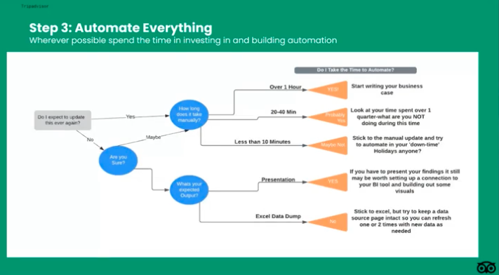
The next step in the process is to automate everything you possibly can. You may not be able to automate everything all at once, but I highly recommend including any manual updates in your use case to try and solve for.
I was lucky enough to work with a stellar data and analytics team who helped me build out the fully automated data model of my dreams, but you can also be iterative in your automation goals.
Get one thing up and running, and start exploring how to do the rest piece by piece.
Step 4: Spend time on your visuals
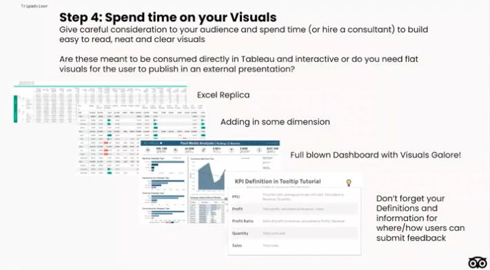
Then, once your dream model is set up, it's time for your visuals!
When transitioning a team who had worked off of Excel exclusively, I needed to start with baby steps.
So, I sent out the manual Excel file along with a Tableau link each week in order to transition users off of Excel and get more familiar with Tableau.
We did a two week overlap of both reports, and then continued to run the Excel for an additional week just in case. Eventually, we transitioned our revenue report into an automated online version.
Each iteration I started to add more to the report.
You can make the data more visually appealing by spacing it out, adding sparklines and data bars to indicate movement and where your eyes should go, and build graphs to supplement your data in both dashboard form and flat views to use in presentations.
Recently I was introduced to ‘stories’ in Tableau. Now I build all of my visuals for our weekly presentations into a story so that all I need to do is export the story, drop it in a slide deck and add my commentary.
I'm still learning and exploring how to automate this manual export piece, and my next tools to explore are FiveTran and Alteryx to automate this piece of the puzzle.
Finally, don’t overlook the importance of metric definitions!
Always include information regarding methodology, definitions, source data, refresh schedules, and who to contact for support, whether it’s in a tooltip or on a table of contents page.
Everyone should be aware of other departments reporting nuances and definitions, and work towards centralization of this information.
All teams collaborating on a presentation should be aware of these potential data discrepancies, and also be able to speak to differences between the teams and systems in order to build trust and credibility.
This is one of the goals of a RevOps function. If you can work towards everyone looking at the same data source, it's much easier to track performance, and ultimately pivot quickly and adjust when the business inevitably calls for it.
Step 5: Spend some more time on your visuals
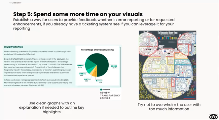
Now for the last and final step, go back and spend some more time on your visuals.
Try to understand your audience’s point of view. Is your report easy to consume and understand by someone other than you?
It's hard to find the happy medium between not enough base data and information overload.
This may be when to tap analytics and or hire a Tableau designer to help you make your report into a visual that's easier to digest.
If you don't have these resources available, play around with visuals yourself - you can find a lot of great stuff online.
Don't try to reinvent the wheel either. In most cases, someone has already built the type of visual for the data you're trying to display.
Just spend some time Googling, find the visual you like and work to recreate it with your data.
And remember to keep it simple!
What about ad-hoc report requests?
We all run into fire drills. While these cases are inevitable, I found it extremely helpful to field ad-hoc requests by using some of the same use case steps I've outlined.
Do a quick estimate of how long you think it'll take to do the quick, basic version vs. building it out properly.
Also, make sure to know what other priorities will be pushed out if you pivot your focus.
Take stock of what you already have and ask around before you start building something that new. Chances are, someone may have asked this question already.
If you feel this ask is something another stakeholder may want to view in the future but you have to do the quick version first due to time constraints, ask for the time after to prioritize building out a more robust report.
Lastly, even in a fire drill situation, try to drop your findings into a deck or at least create a summary page of your report so that when your data is shared out, the user can quickly discern the key takeaways without having to do a deep dive into your analysis.
💡 Key takeaways

- When building your reports, automate, automate, automate! If you're spending over half your time building and less than 20% of your time analyzing the data, it's time to start building a use case for automation resources.
- Spend more time thinking about your audience. Build visuals and infographics to illustrate your findings and let your data tell a story.
- Ask for help, and don't try to reinvent the wheel if you don't have to.
- Lastly, keep learning, connect with other RevOps colleagues and share your knowledge.
🤔 Common RevOps questions
When is the right time to build a RevOps team?
I started when I saw discrepancies between all of our processes and reporting. However, as soon as you can is the best answer.
Once you get an idea of a centralized report coming out all of a sudden from different sources, that’s when you could say that here's a key use case and you might want to start RevOps function.
How do you ensure consistent and high quality data inside of your Salesforce instances? Is this automated or still has manual parts to it?
Data is always going to be difficult to work with, and you're gonna spend tons of time cleaning it, but there's only so much you can do.
At Convene, we had a person who was dedicated to this task who was known as ‘the data police’. They were the person who made sure the sales team were entering data correctly.
The best bet to go for is to automate everything you can to reduce the amount of sales reps inputs that are manual, like reducing text fields for example.
At the end of the day, you also have to note if there are caveats in your data, if there are certain things you're unable to control and you're not able to report on as accurately as you wish.
Write a little sub note in there, just so that it's noted in your definitions.
With Salesforce’s acquisition of Tableau, do you see business intelligence becoming more democratized and accessible by sales (such RevOps) or still the domain of data scientists/specialists?
I believe that RevOps will start being more and more into the actual data, especially with Tableau as the self service reporting is much easier to access.
However, the tricky part that I've found with accessing Salesforce data directly in Tableau is that it's usually all of the data from Salesforce so it's a very heavy load.
That's where I prefer to access everything using SQL from our data warehouse, but if you don't have a data warehouse and that's your only option, definitely do that.


Sales enablement insider
Thank you for subscribing
Level up your sales enablement career & network with sales enablement experts
An email has been successfully sent to confirm your subscription.
 Follow us on LinkedIn
Sales enablement insider
Thank you for subscribing
Level up your sales enablement career & network with sales enablement experts
An email has been successfully sent to confirm your subscription.


.svg)